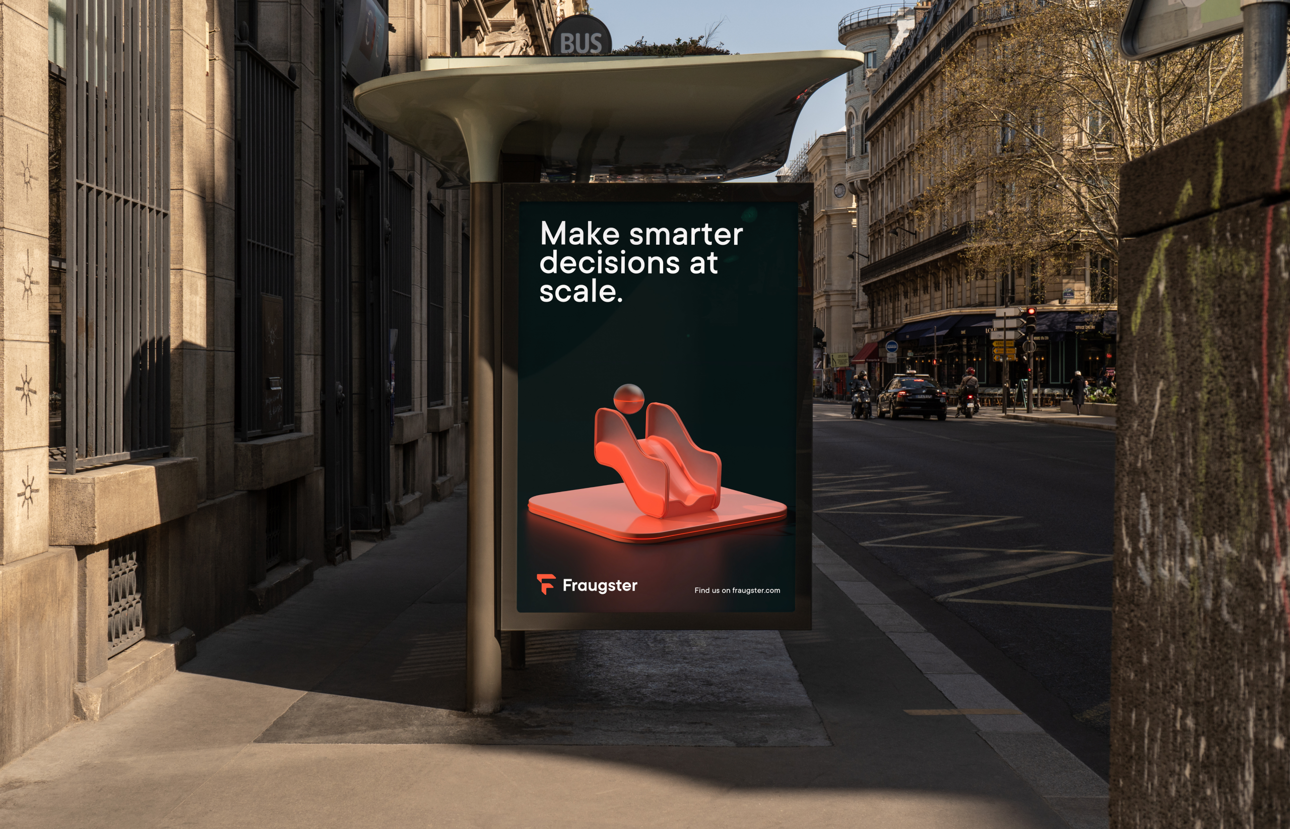
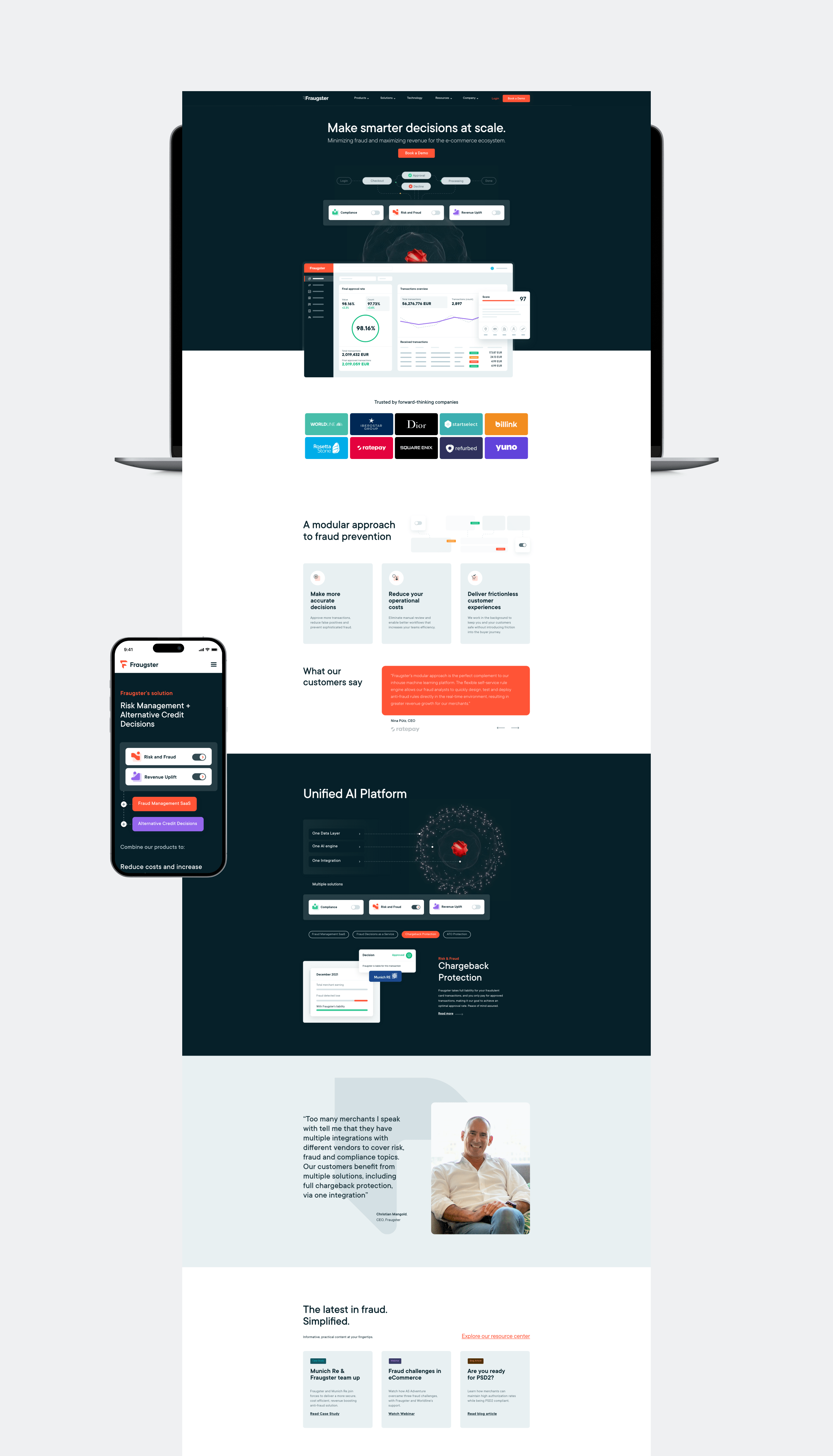
Fraugster is a payments intelligence company that helps the e-commerce ecosystem to minimize fraud and maximize revenue by making smarter real-time business decisions.
Services
Brand Strategy
Brand Identity
Web Design
Digital Assets
Marketing Collateral
Industries
Fintech
DEPTH
MODULARITY
AND CONNECTIVITY.
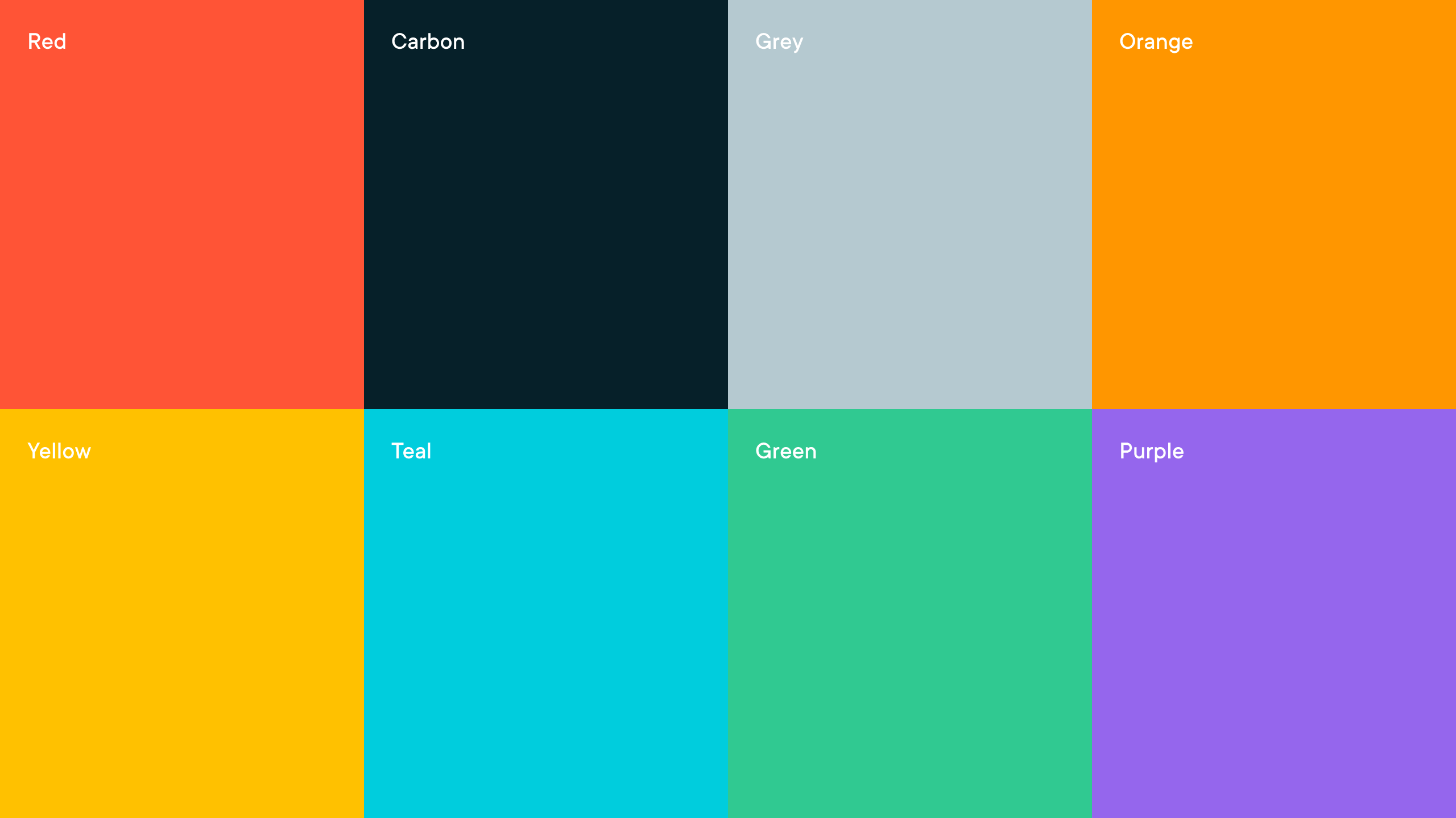
The primary palette consists of the core red and carbon gray values. The red color represents excitement, passion, danger, energy, and action. The carbon color is dominant in the default themes, making use of subtle shifts in value to organize content into distinct zones. The secondary palette is robust and vibrant, offering depth to the marketing communications and product UI. The secondary colors are meant to support the primary red, therefore minimizing usage and hierarchy should be considered when being used.

WEB
DESIGN.
THE
SYSTEM.
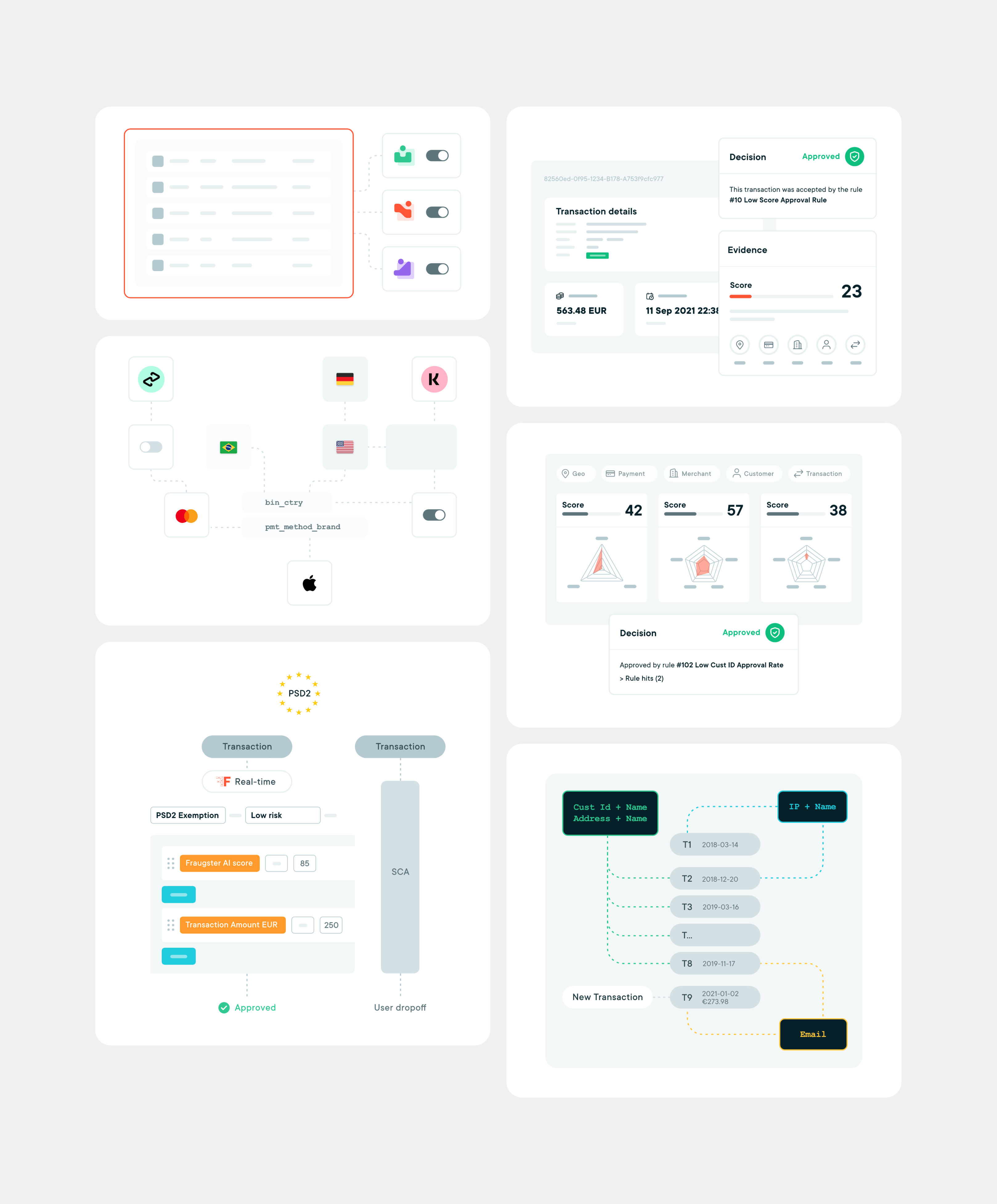
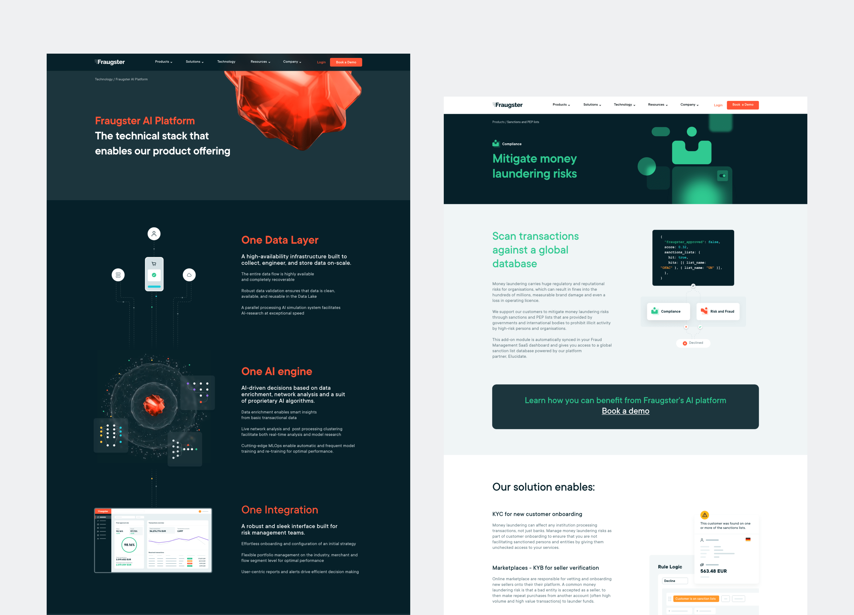
The 3D product categories inhibiting the platform, obtain it’s own symbol that reflects the associated meaning of it’s unique practice, together with a color value.