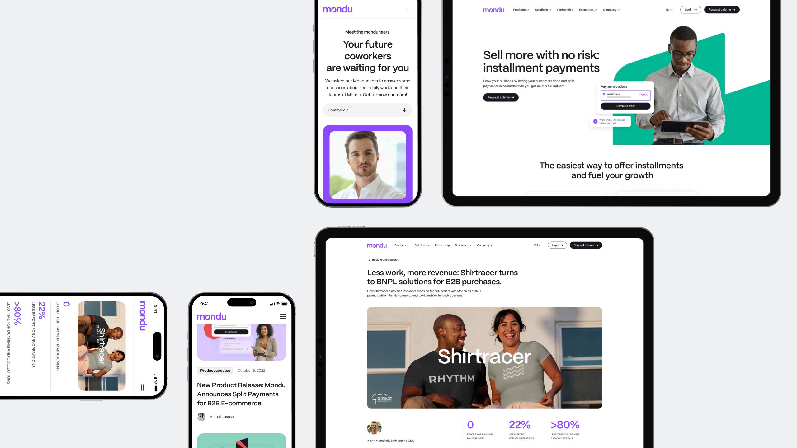
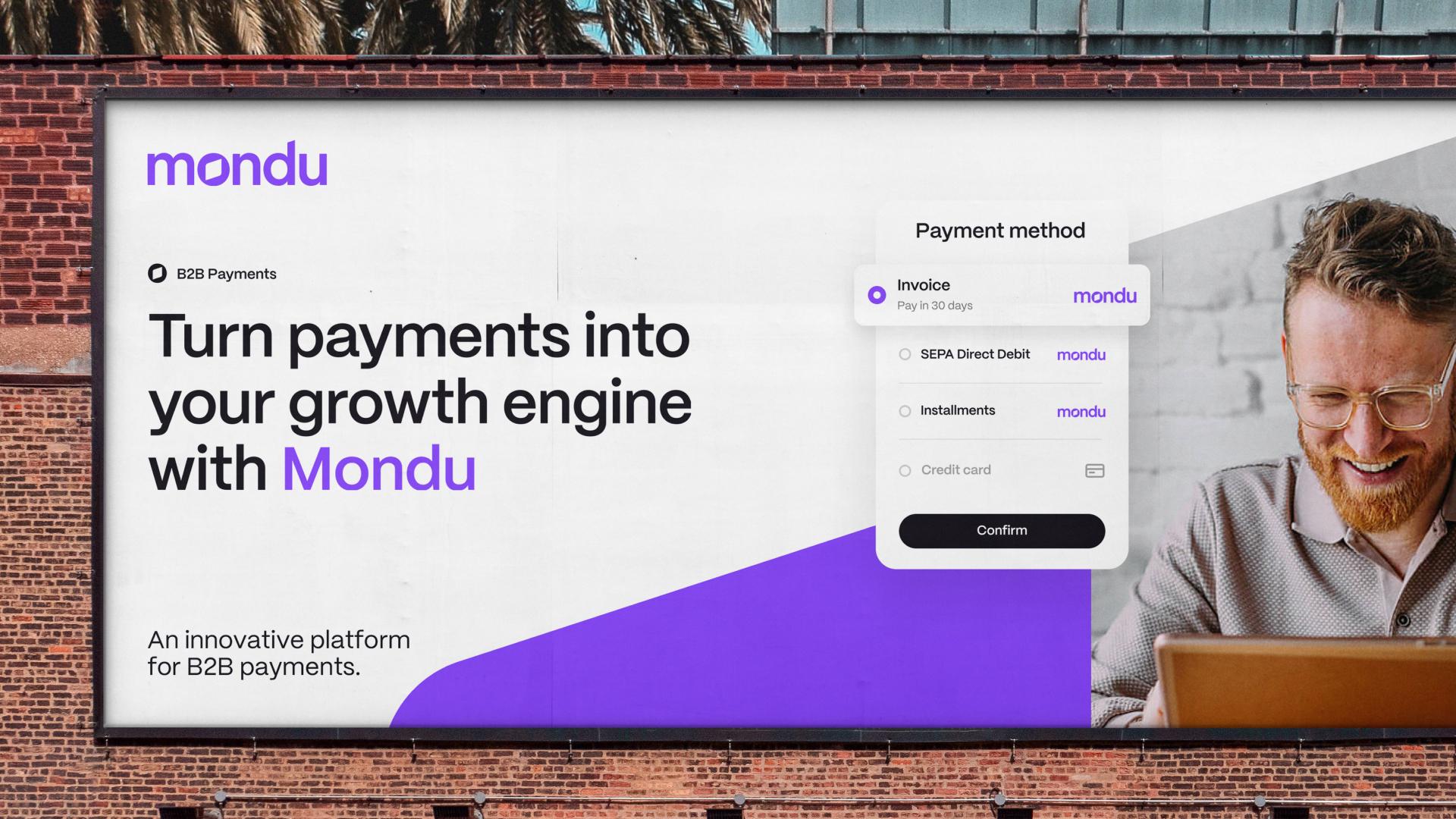
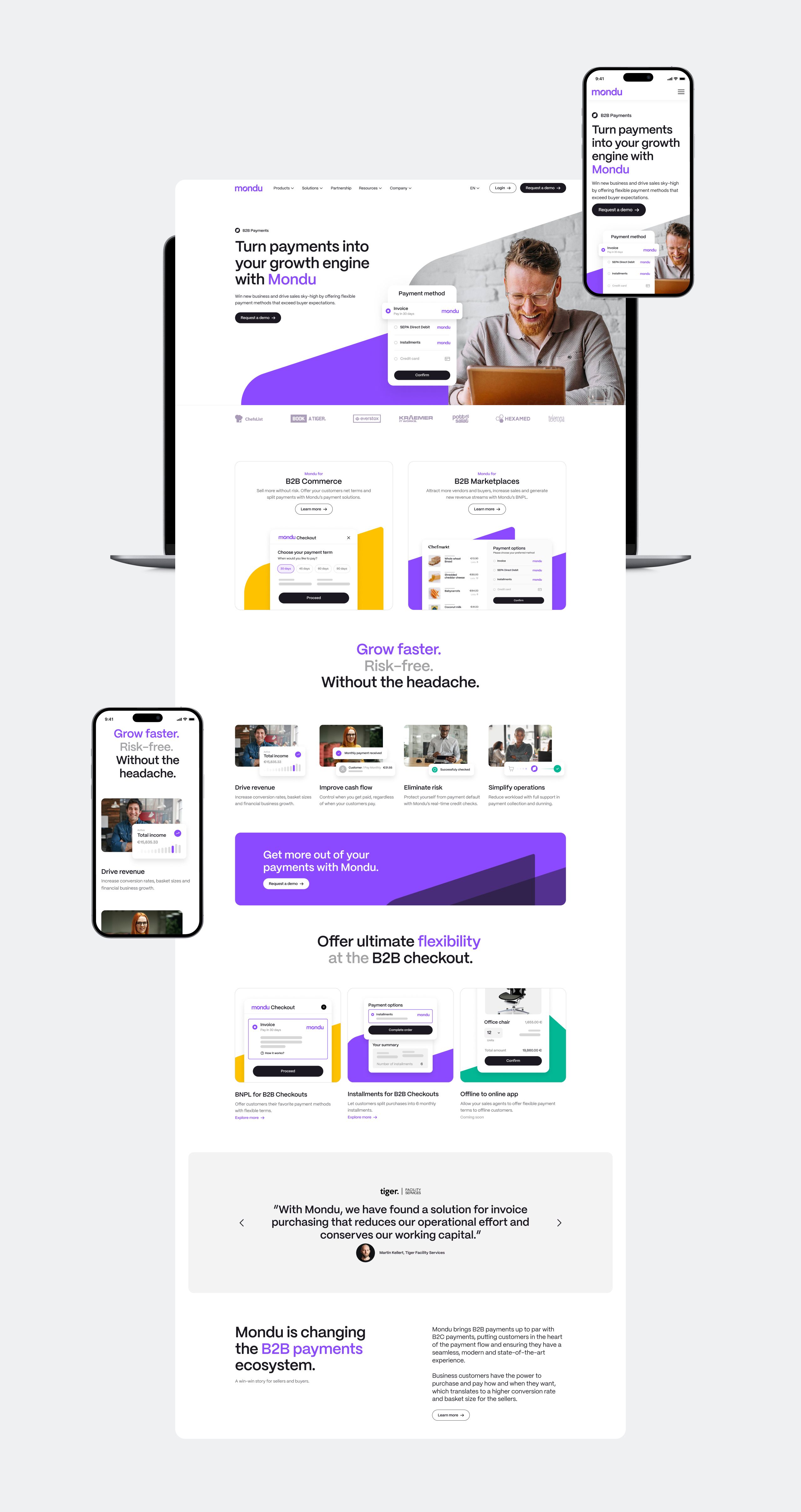
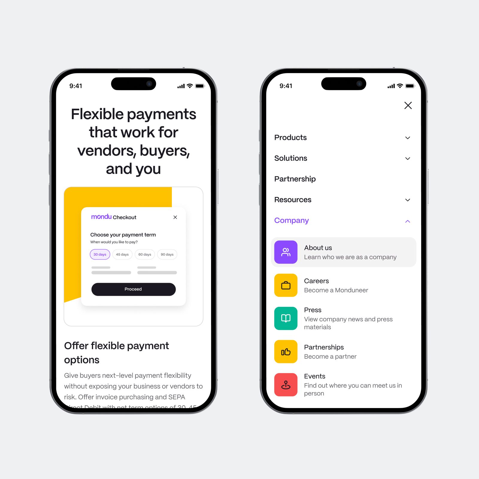
Mondu, a European fintech start-up, is aiming to disrupt the archaic B2B payments industry and establish itself as a B2B growth catalyst through offering flexible payment services to both online and offline B2B companies.
We got the chance to brand it. Han Rabinovitz, as Chief Strategist, crafted a strategy that associated Mondu with something bigger than digital payment services. We wanted to build an engaging story for Mondu, one that would be relevant to both buyers and sellers.
Services
Brand Strategy
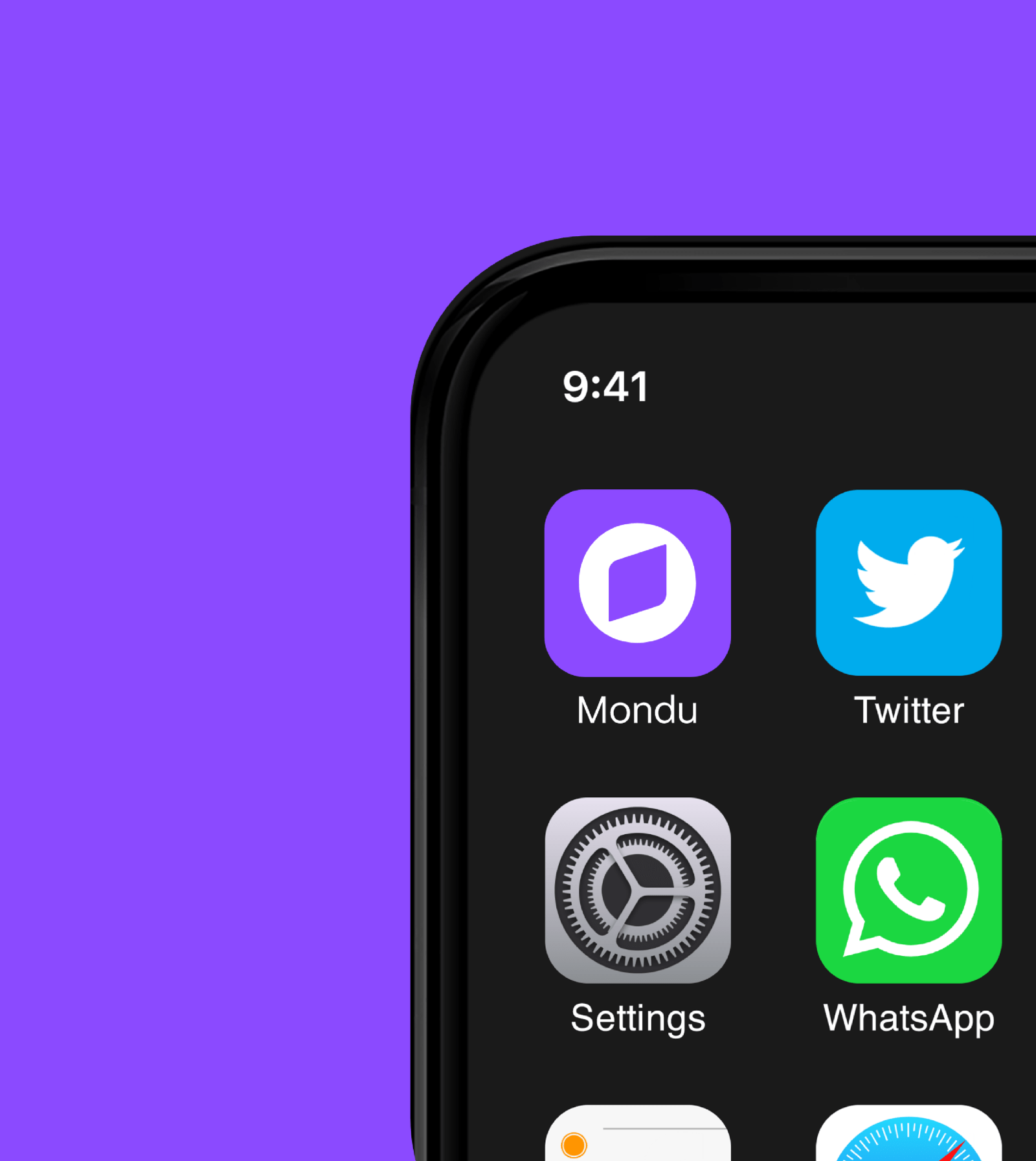
Brand Identity
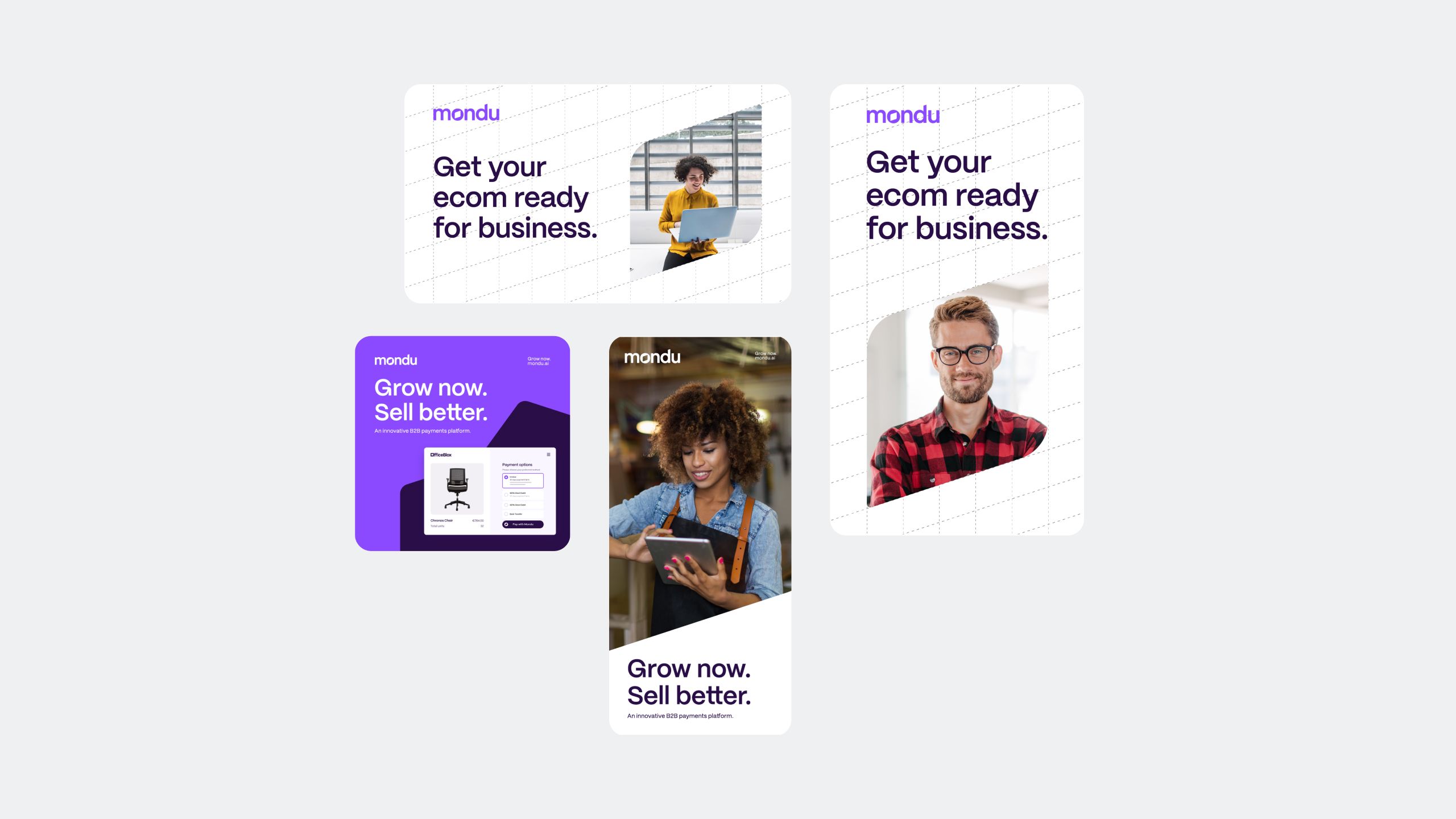
Web Design
Digital Assets
Marketing Collaterals
Industries
Fintech
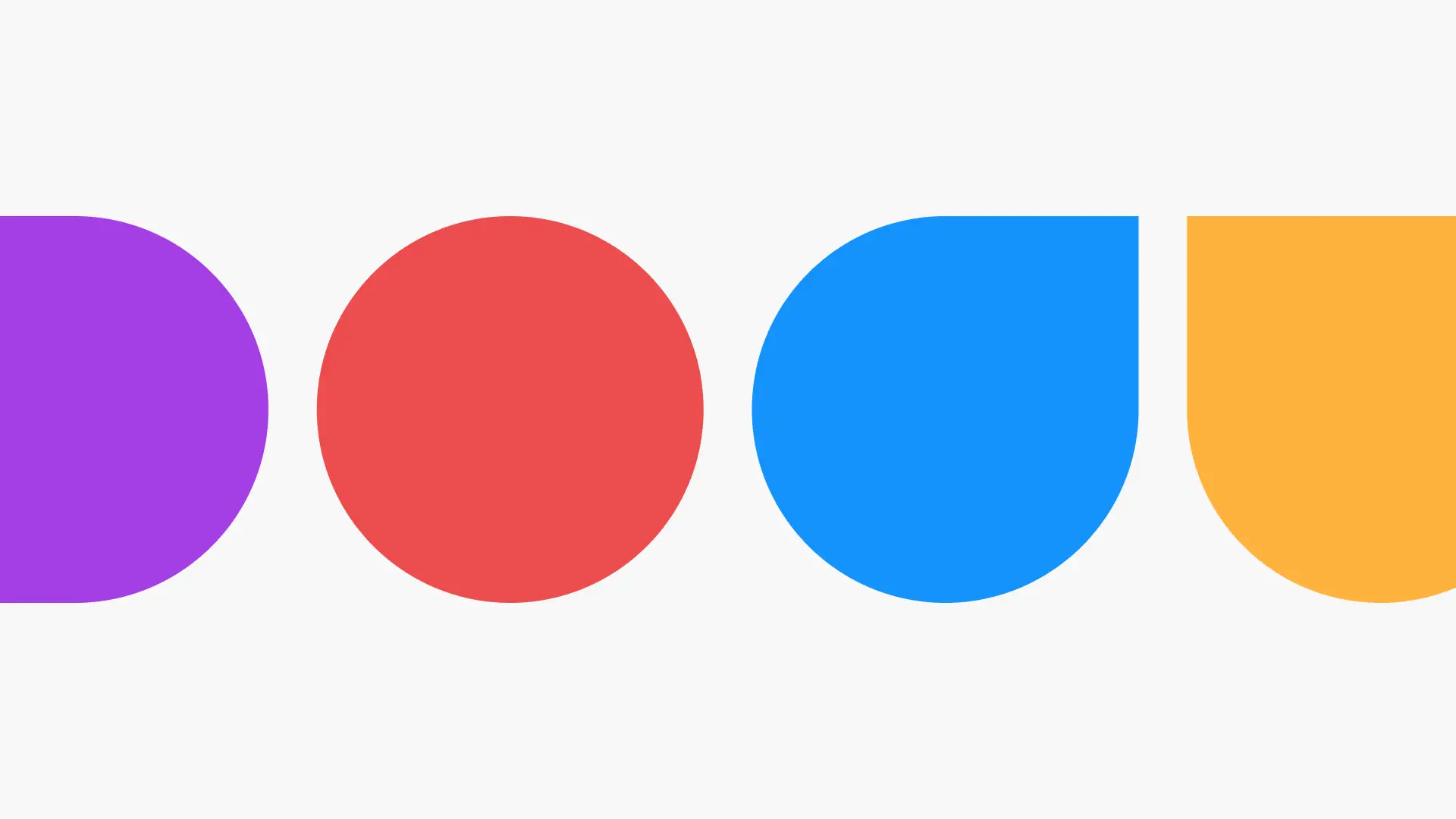
LOGO. COLORS.
SHAPES.
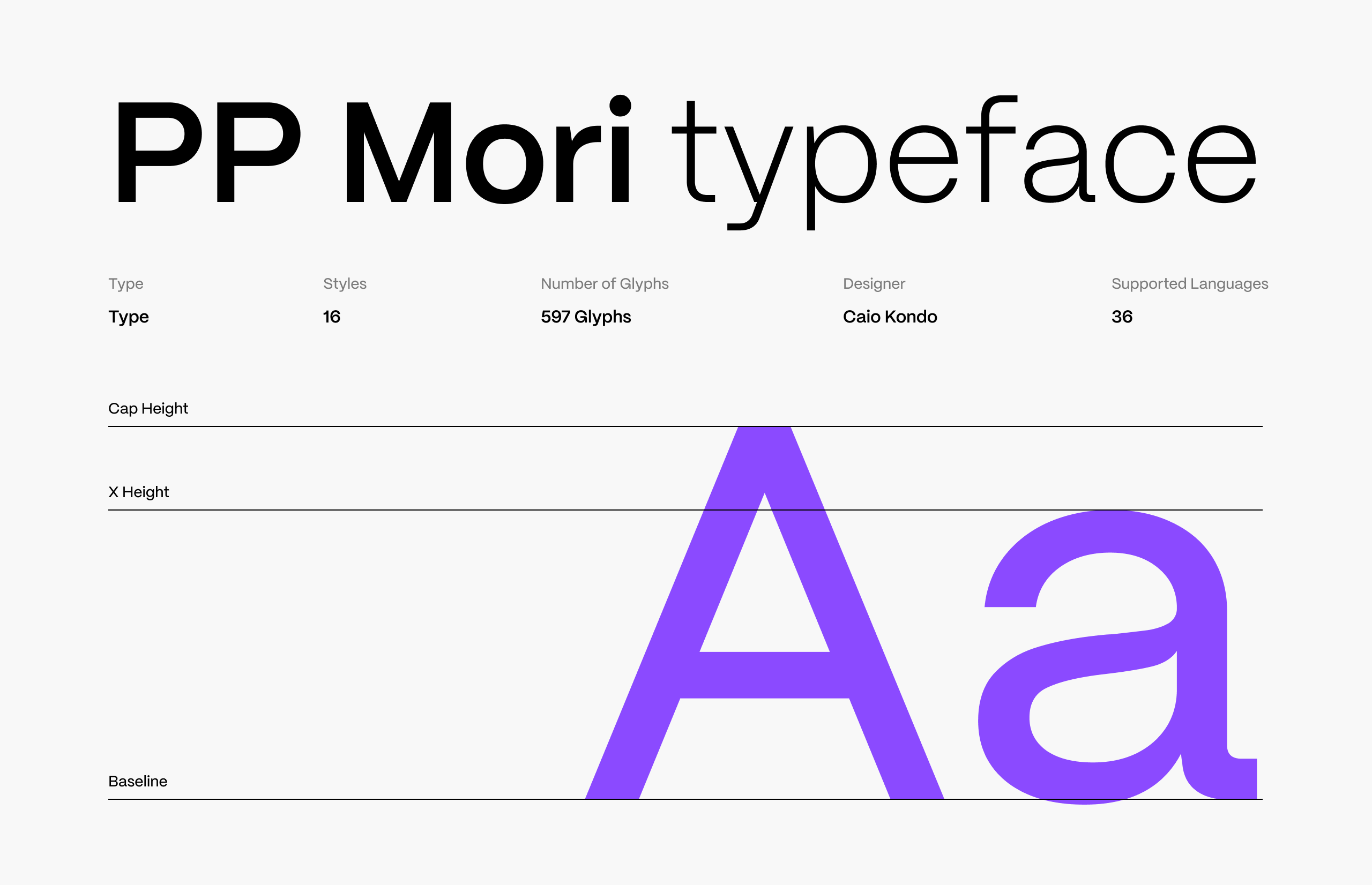
We created Mondu's updated visual language by combining its digital technology with classic monetization and payment symbols. The Mondu logo-type is a square cut in the shape of an ancient coin that also resembles a 3D impression of a credit card. Its also a compass needle pointing up, as a symbol of growth.
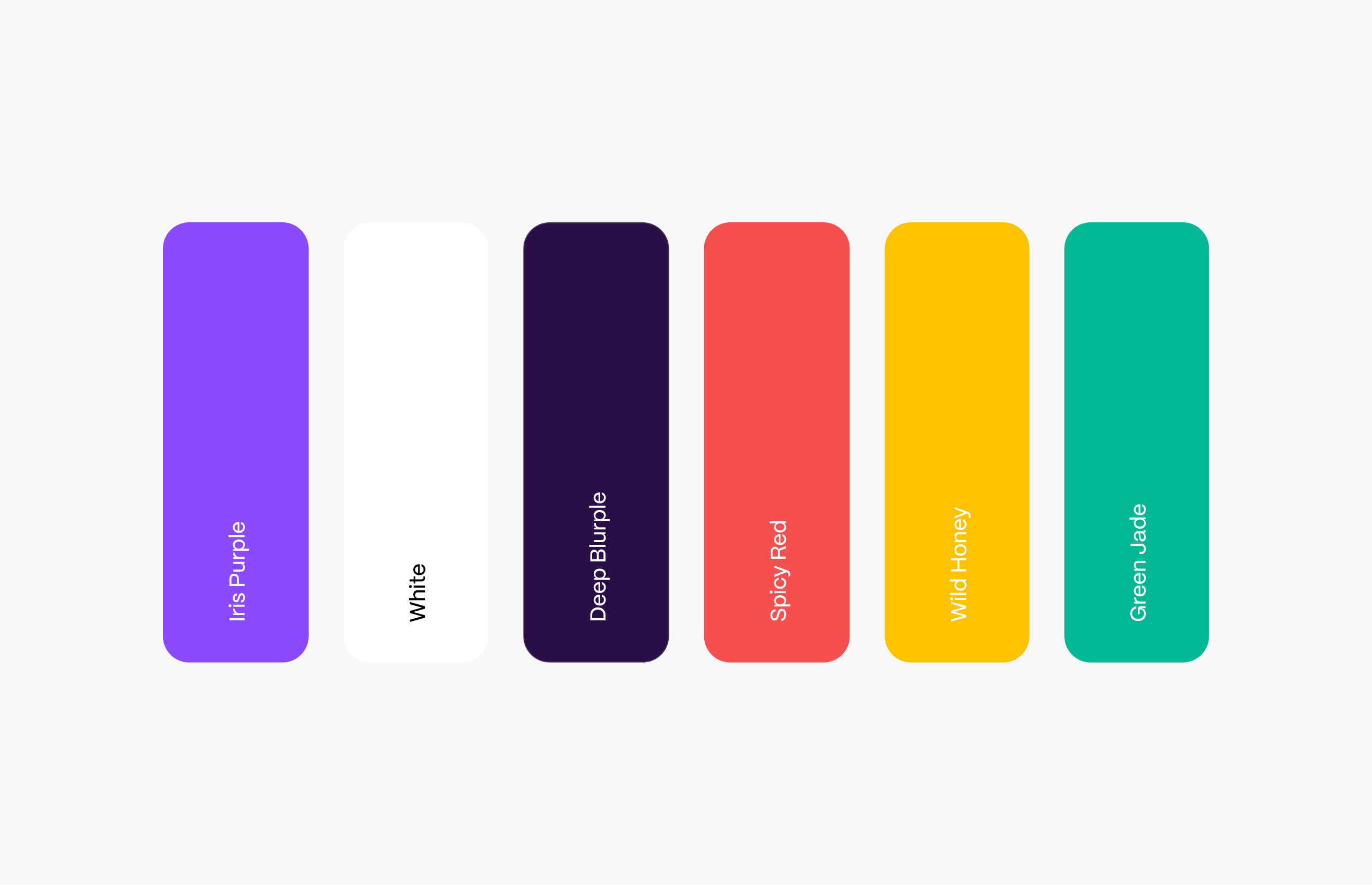
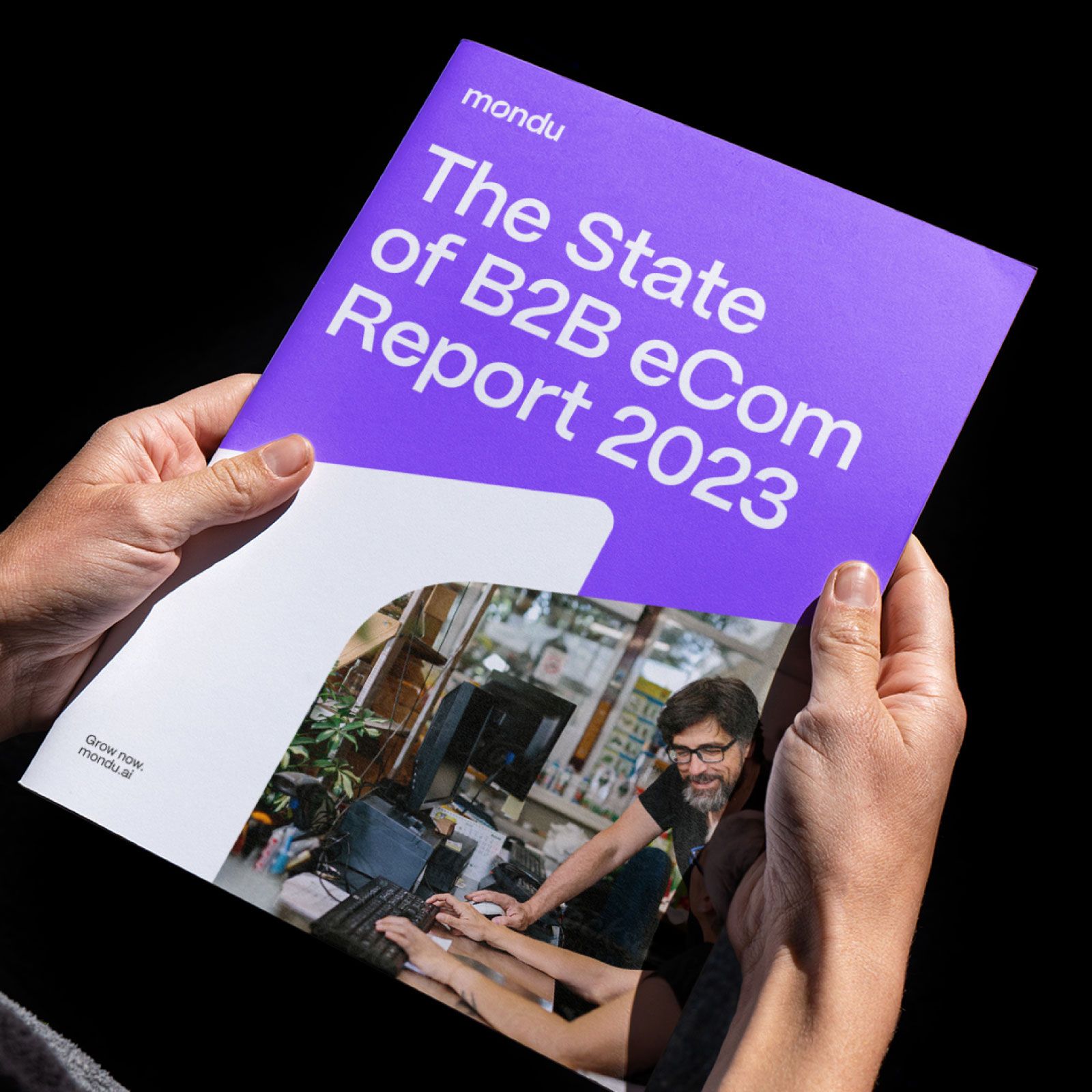
Mondu's new color palette reflects courage and optimism on one hand, and wisdom and ambition on the other, through a bright purple and yellow palette. The brand echoes stability and a commitment to providing safe and reliable financial services.
The basic shape is driven from the internal “O” symbol based on the compass needle. This shape leads the way, and manifests the “grow now” mood. The Mondu shape can be used in various ways in order to create compositions. The shape could be used as a background or as a layout divider.

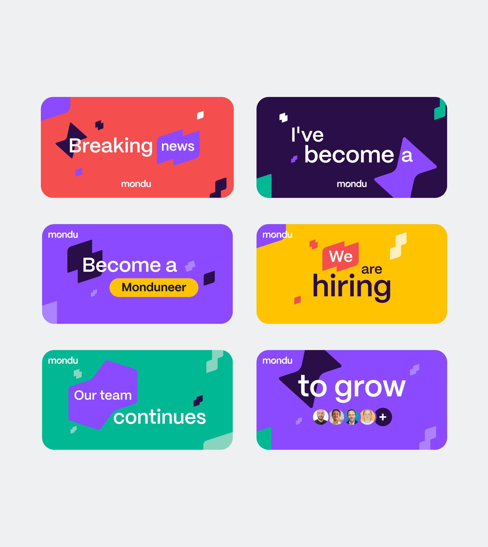
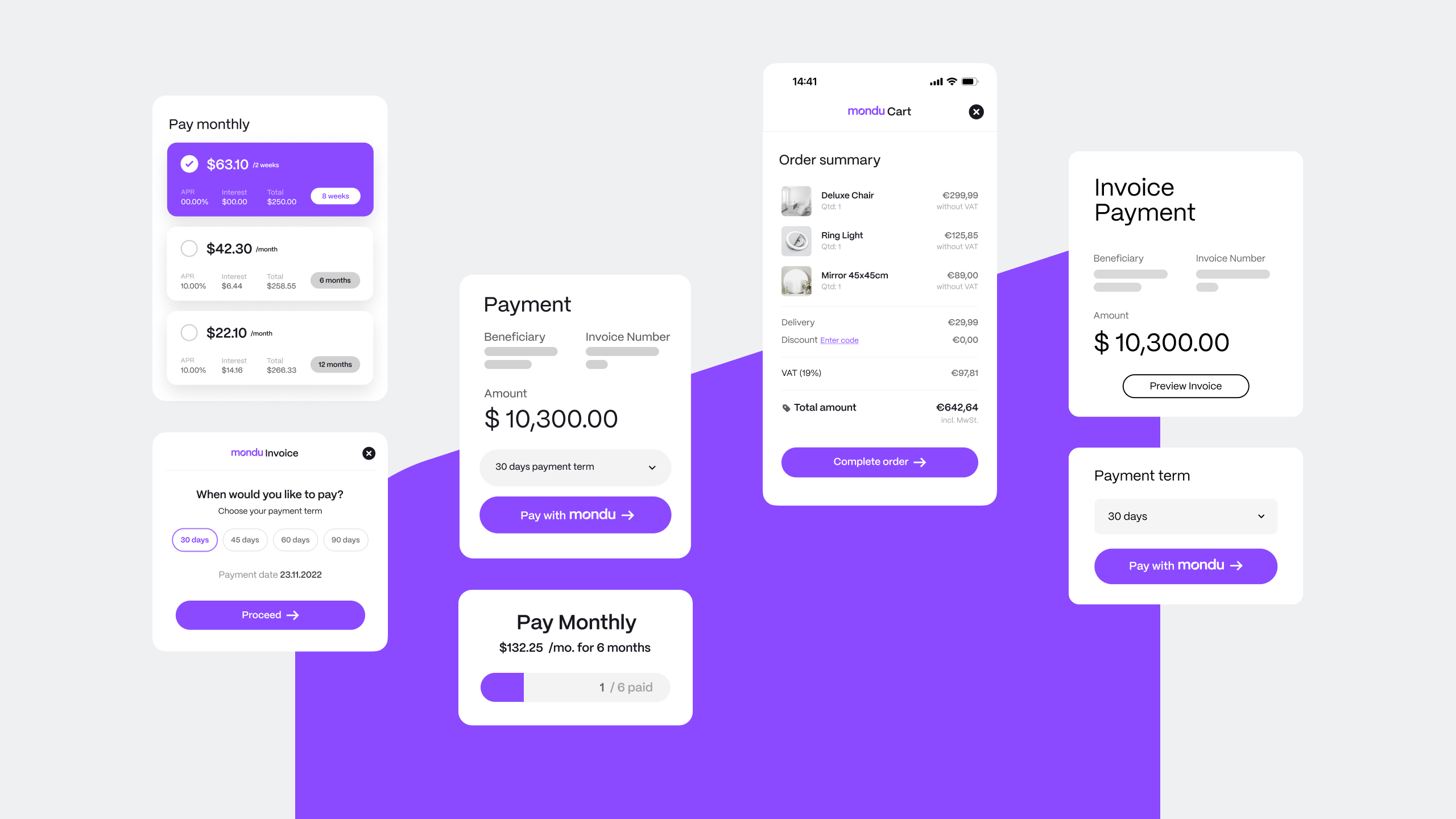
The dedicated crafted shapes are a central design element in Mondu's brand identity system. The overlapping space between the shapes refers to the moment of encounter or the financial connection. The rotation angle corresponds with the Mondu logo, and repeats the “Grow now” more visually.


“Developing our new brand identity was an amazing experience, working hand-in-hand with the RNGS team, from strategy to design. We truly felt we found the right partner for this process. All of the deliverables that were promised went well beyond our expectations. The new brand identity is stunning, and everyone in Mondu loves it. We get wonderful feedback from both employees and customers”.

Naama Sheba
Chief Marketing Officer